Technical damage is increasing, at the same time the S&P 500 chart is hitting the Moving Average 200 which should provide support. Some charts look like they are trading at or near inflection points. Selling pressure with the Euro and Crude Oil eased a bit today. Something to keep an eye on. Good time to be mostly in cash.
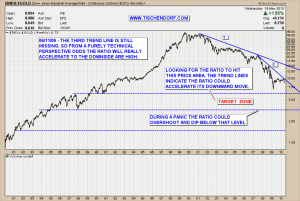
Another thing worth watching is the chart of the Dow Jones Industrial / Gold ratio chart that has been on my public list for quite some time:
Up-to-date Dow Jones Industrial / Gold Ratio chart on my public list.
So far price has respected the Trend Lines I drew into the chart. The Accelerating Trend Lines concept is a simple means to visually display accelerating trends on a chart. They usually come in series of three. The number 3 is a very important one in technical analysis. The 1-2-3 or ABC move being just one prominent example.
Here’s what John Murphy has to say about Accelerating Trend Lines in his book: ‘Technical Analysis of the Financial Markets’ (Pages 77-79):
How to Adjust Trendlines:
Sometimes trendlines have to be adjusted to fit a slowing or an accelerating trend. [..] If the original trendline is too flat, it may have to be redrawn at a steeper angle. […] The uptrend accelerated, requiring a steeper line. A trendline that is too far away from the price action is obviously of little use in tracking the trend.In the case of an accelerating trend, sometimes several trendlines may have to be drawn at increasingly steeper angles.
Keep in mind the ratio could accelerate while both Gold and the Dow Jones move up or both move down simultaneously. It doesn’t necessarily mean Gold has to rise for the ratio to test much lower levels. Gold just needs to outperform. That could mean falling less than the Dow.
The trend is your friend.
My public list with all my charts can be viewed here:
http://stockcharts.com/def/servlet/Favorites.CServlet?obj=ID2791469
Buenas noches!
